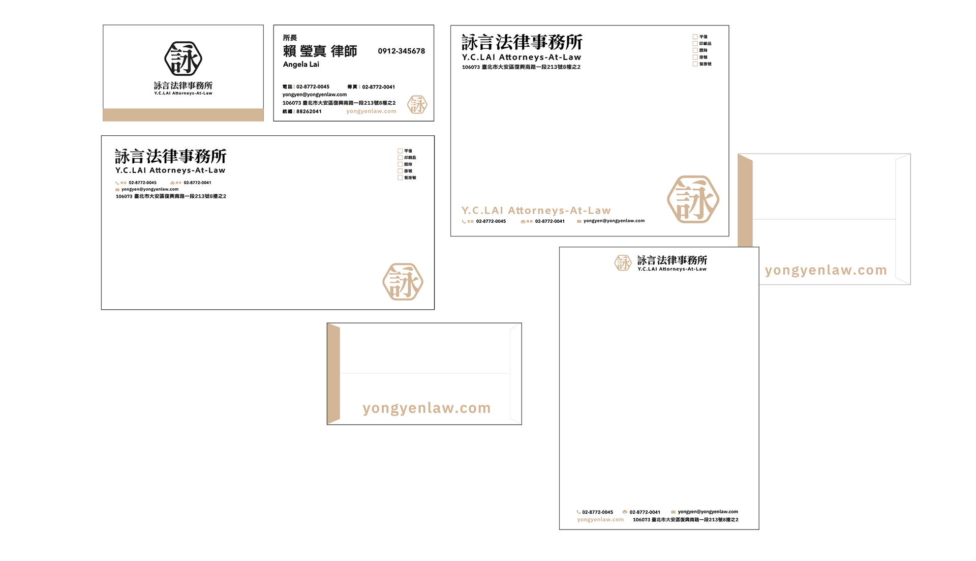
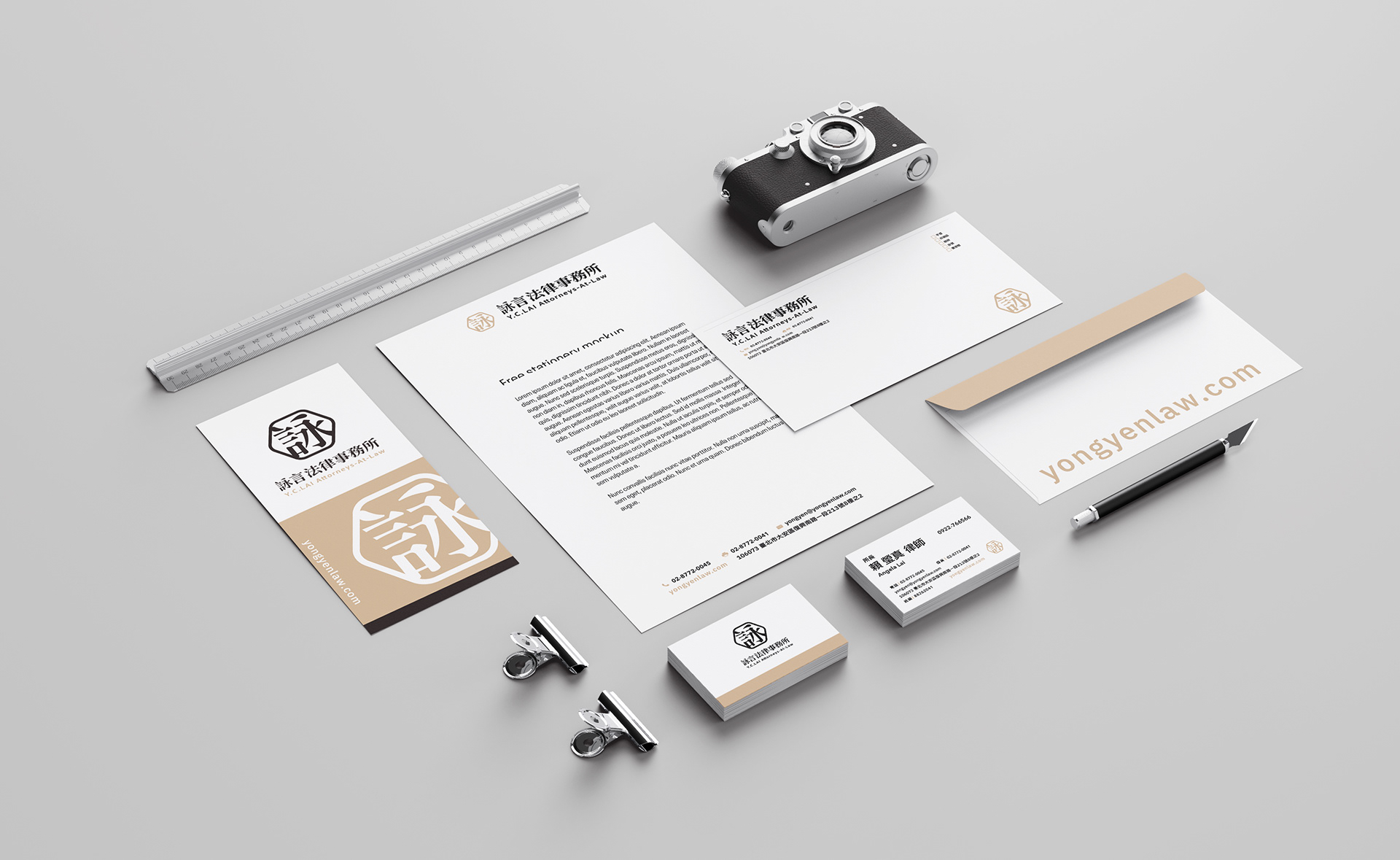
詠言法律事務所
Y.C. LAI Attorneys-At-Law
結合「導圓角」、「六角形」與「印鑑」的元素,傳達專業與可信賴的形象。「導圓角」的設計手法象徵圓滿處理案件、與客戶建立和諧關係;「六角形」則代表穩健與結構完整,象徵事務所的法律專業性及穩固的基礎;「印鑑」的元素強調權威與正式感,象徵法律的嚴謹性及事務所的權威性。整體設計以簡約大氣的風格呈現,搭配深色調和精緻的字體,凸顯事務所的專業形象,同時營造出值得信賴的品牌氣質。
The design technique of "rounded corners" symbolizes the successful handling of cases and the establishment of harmonious relationships with clients; the "hexagon" represents stability and structural integrity, symbolizing the legal professionalism and solid foundation of the firm; the element of "seal" emphasizes authority and The sense of formality symbolizes the rigor of the law and the authority of the firm. The overall design is presented in a simple and elegant style, with dark colors and exquisite fonts, highlighting the professional image of the firm and creating a trustworthy brand temperament.
Client / 詠言法律事務所
Category / 企業識別 VI
Design / 柳捲 Rush Liou
Release / July, 2024

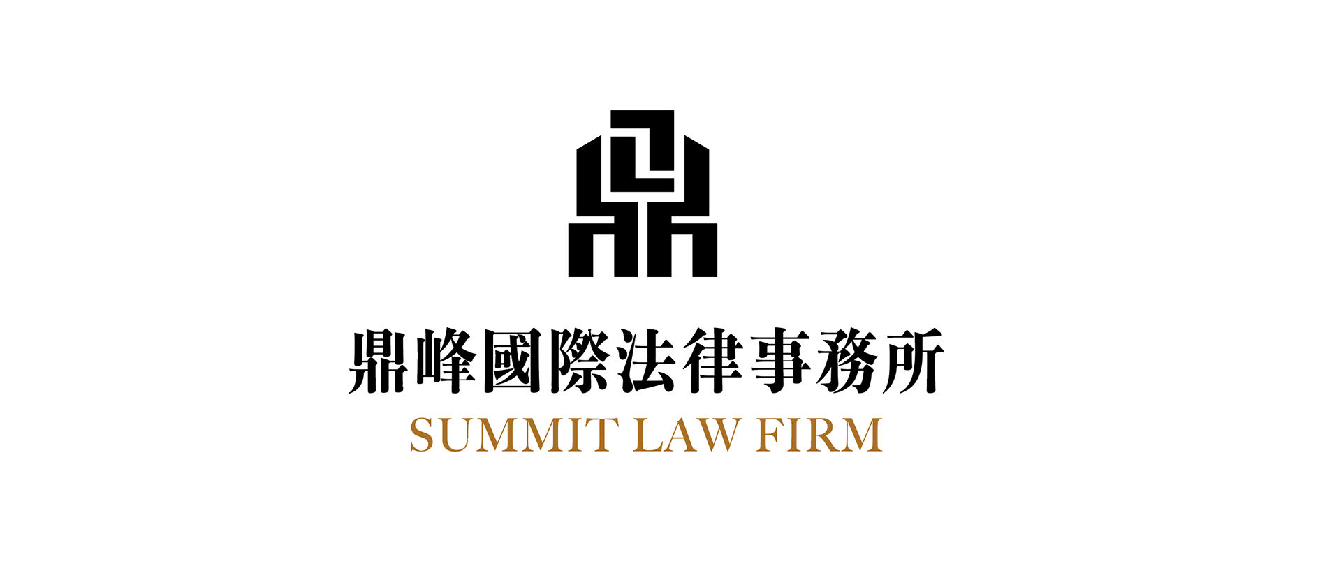
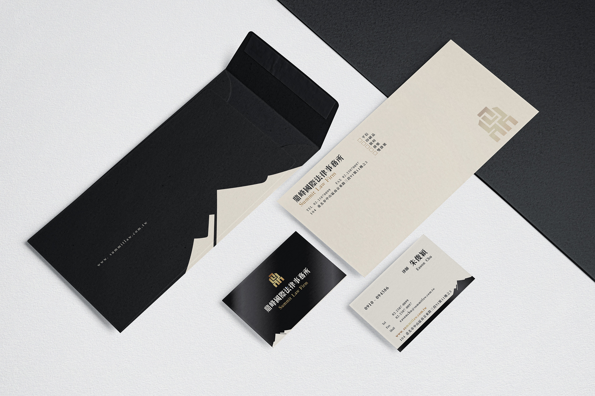
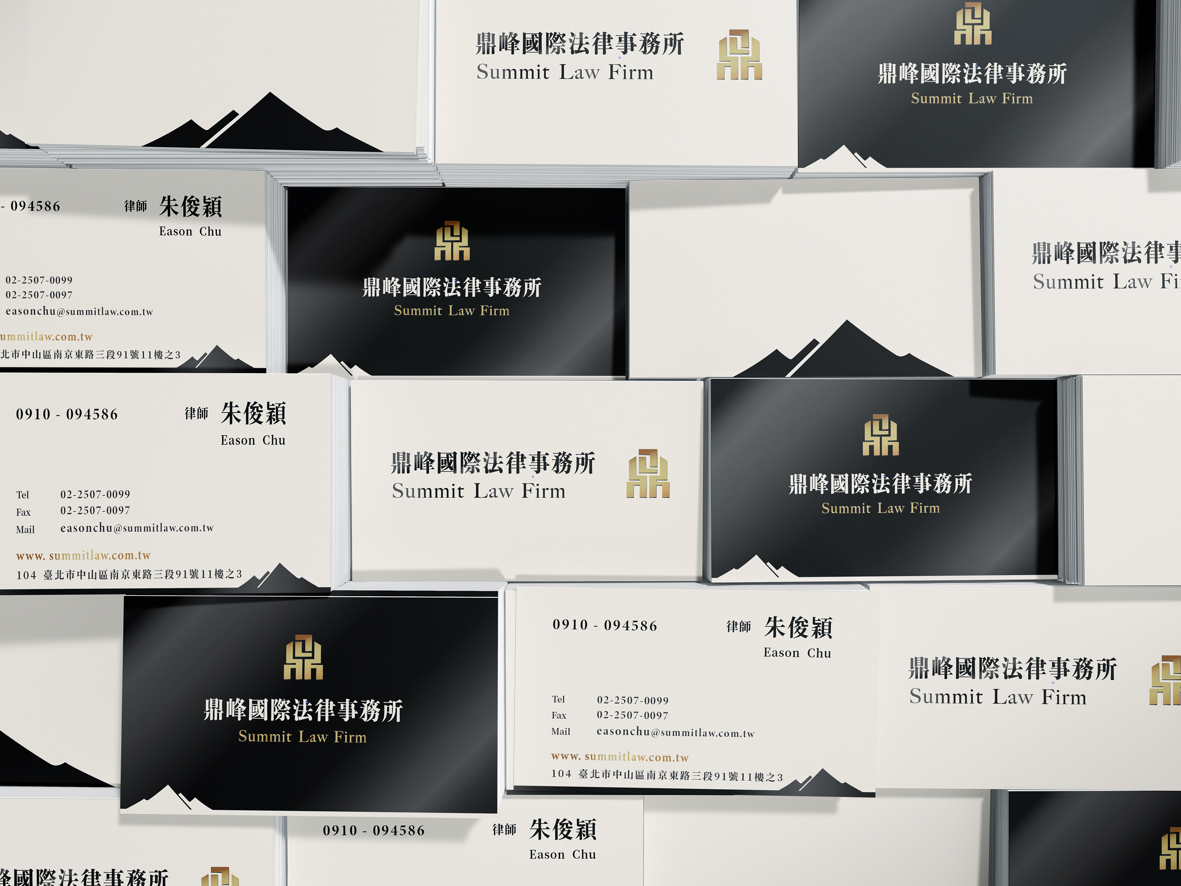
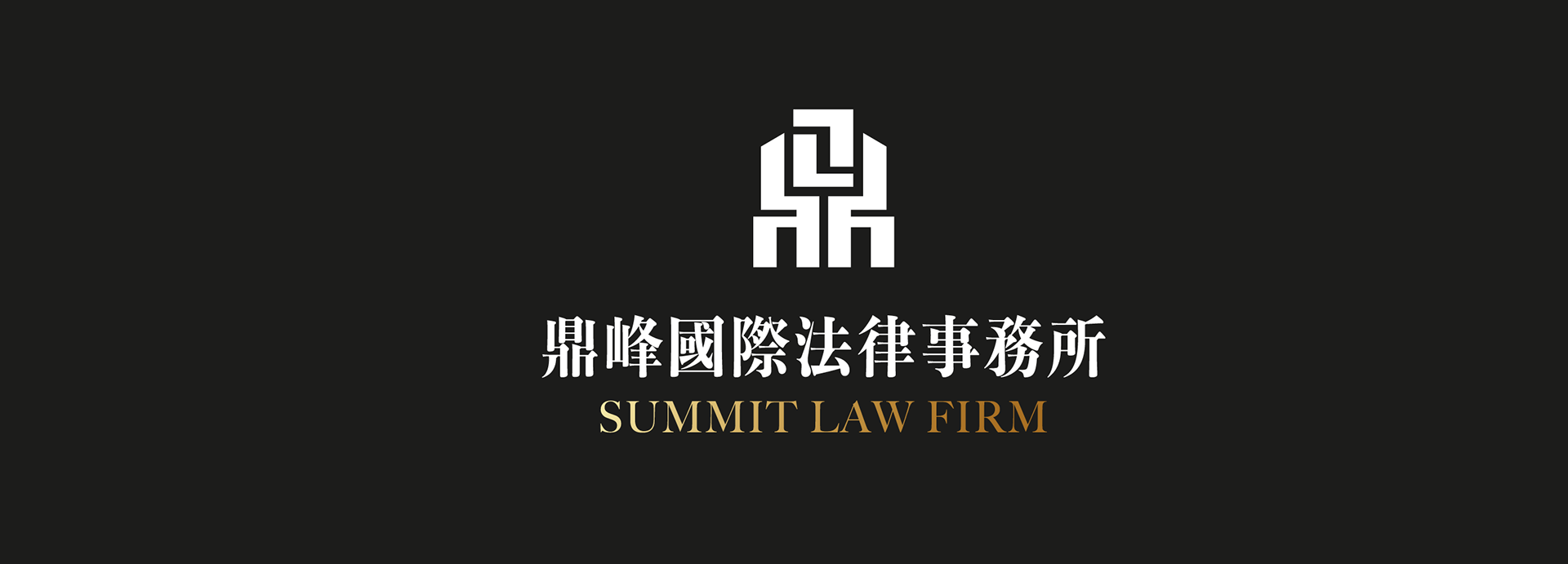
鼎峰國際法律事務所
Summit Law Firm
「鼎峰國際法律事務所」的企業識別設計以古代青銅器「鼎」為核心元素,象徵權威與影響力,體現「一言九鼎」的穩重大氣。LOGO採用金色的鼎形圖案,搭配偏窄的襯線字體,營造出事務所的正式與專業感,傳遞法律服務的可信度與權威性。「峰」則象徵追求卓越、再創巔峰的精神,代表事務所在法律領域的高度成就與不懈努力。主色調以濃重肅穆的色彩為基底,增強品牌的莊重感,同時在印刷品中使用柔和的米色作為背景,平衡了嚴謹的法律氣息,為客戶帶來穩定且安心的感受。
Ding, one of the ancient bronze ware forms, is used in rituals. The idiom "one word has a great effect" means that the speech has a great influence and a great effect; the peak, the towering mountain, is a word often used to represent when one surpass oneself and recreate the peak and the peak. The LOGO uses the golden tripod and narrow serif fonts to create a formal and professional sense of the office. Because the main color of the brand is thick and solemn, the printed matter is based on a soft beige, which brings customers a sense of stability and peace of mind in the solemnity of the legal provisions.
Client / 鼎峰國際法律事務所 Summit Law Firm
Category / 企業識別 VI
Design / 柳捲 Rush Liou
Release / Oct. 2020
Design / 柳捲 Rush Liou
Release / Oct. 2020
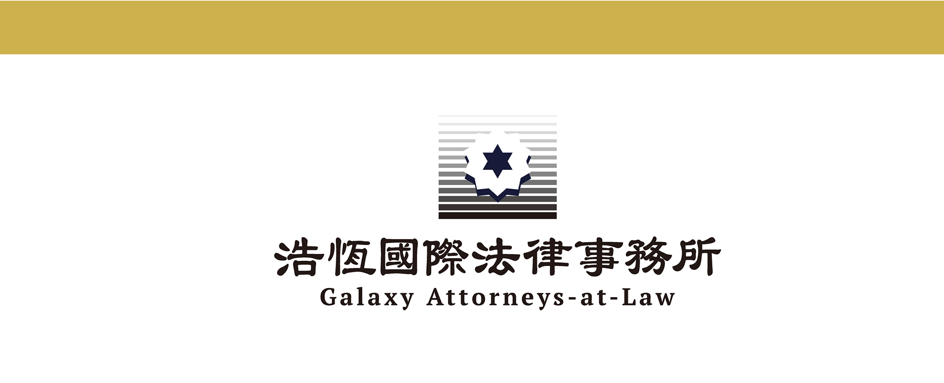
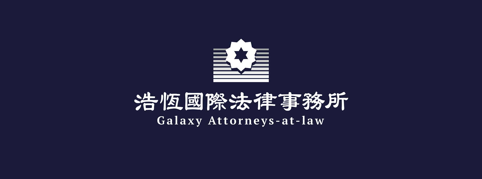
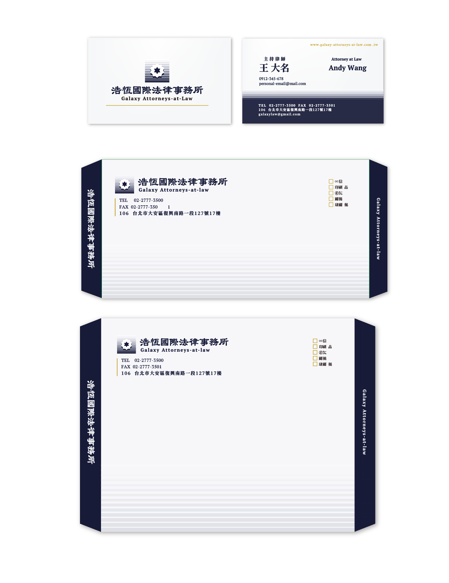
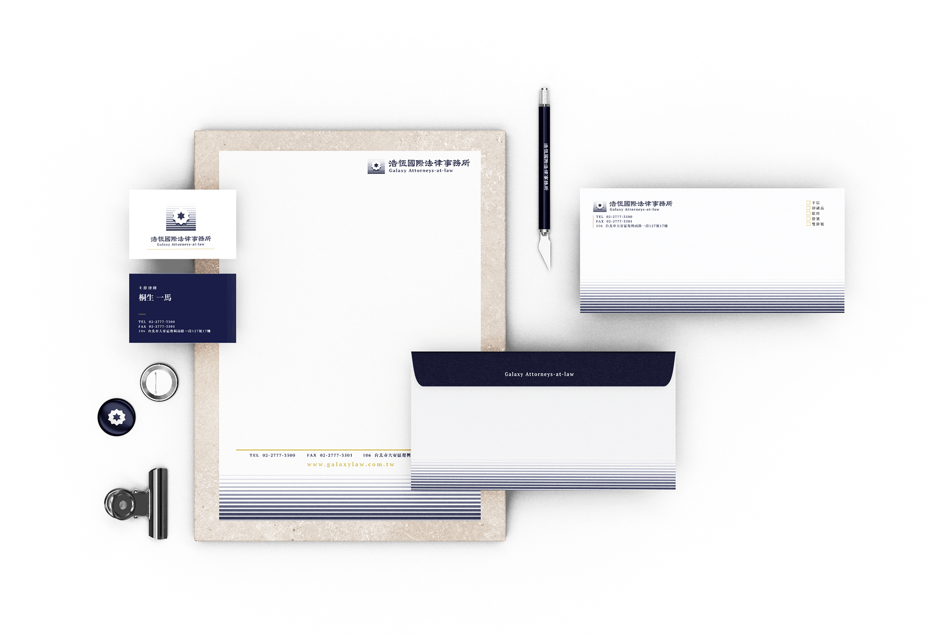
浩恆國際法律事務所
Galaxy Attorneys-at-law
以多角星型為LOGO,象徵法律的多元與精確,並寓意事務所如星辰般穩定而具影響力。主色調採用日本古色「勝」,代表勝訴的美好祝願,增添法律事務所的專業與自信。輔助色則以「月白」結合宇宙感,呈現事務所胸懷廣闊、遠見卓識的形象。同時運用「芥子」色作為跳色,為深藍與灰白的嚴謹主色調注入溫度與親和力。整體設計在保持專業沉穩的同時,傳達出溫暖的人文關懷,展現出浩恆國際法律事務所既精準律法又具有包容性的品牌形象。
The identity design uses a multi-pointed star as the LOGO, symbolizing the diversity and precision of the law, and implying that the firm is as stable and influential as a star. The main color is the Japanese antique color "Katsu", which represents the best wishes for winning the lawsuit and adds to the professionalism and confidence of the law firm. The auxiliary color is "moon white" combined with a sense of the universe, showing the firm's broad-minded and far-sighted image. At the same time, "mustard" color is used as a jumping color to inject warmth and affinity into the rigorous main colors of dark blue and gray white. While maintaining professionalism and composure, the overall design conveys warm humanistic care and demonstrates the brand image of Haoheng International Law Firm that is both precise and inclusive.
Client / 浩恆國際法律事務所
Category / 企業識別 VI
Design / 柳捲 Rush Liou
Release / Dec. 2019