VOL 六週年品牌識別更新
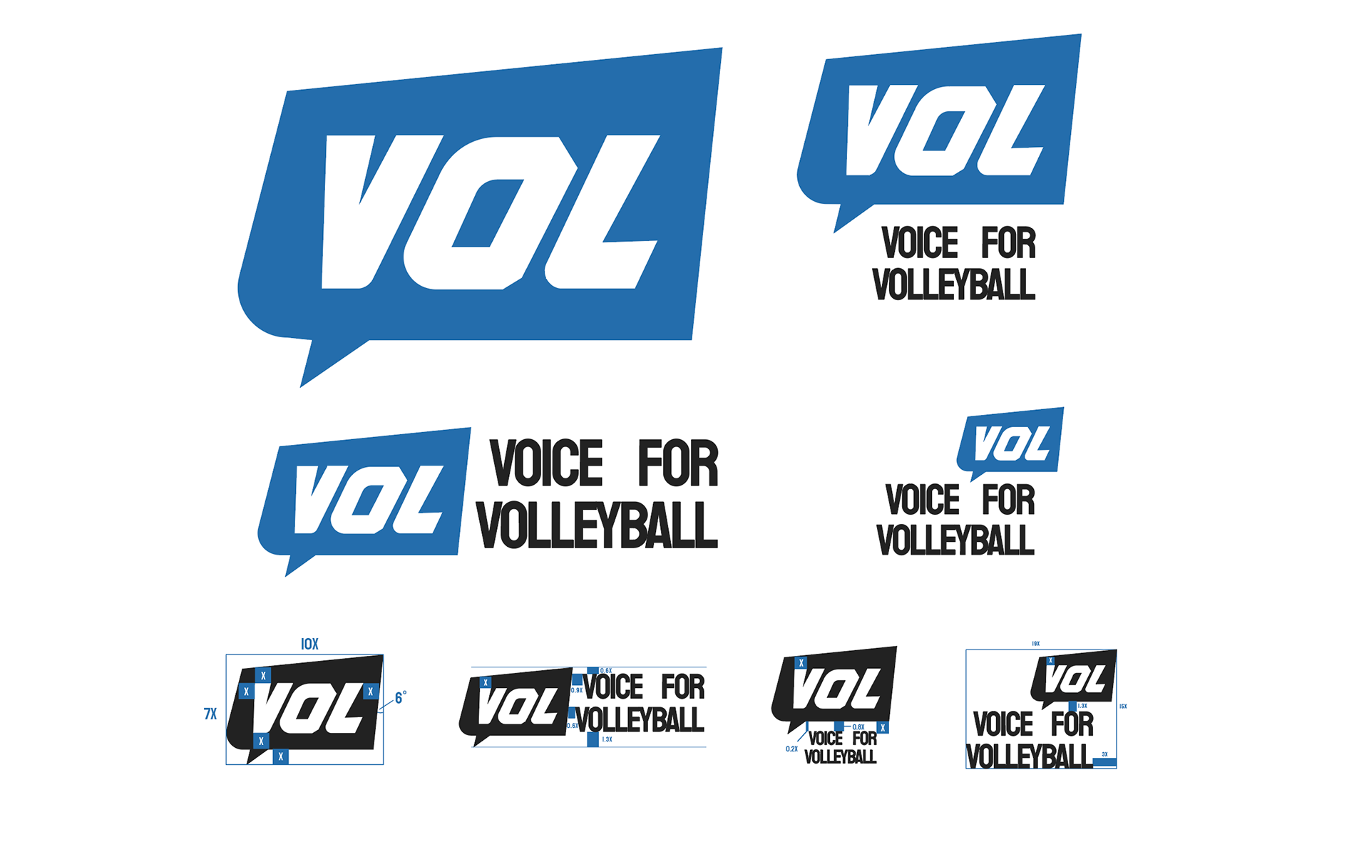
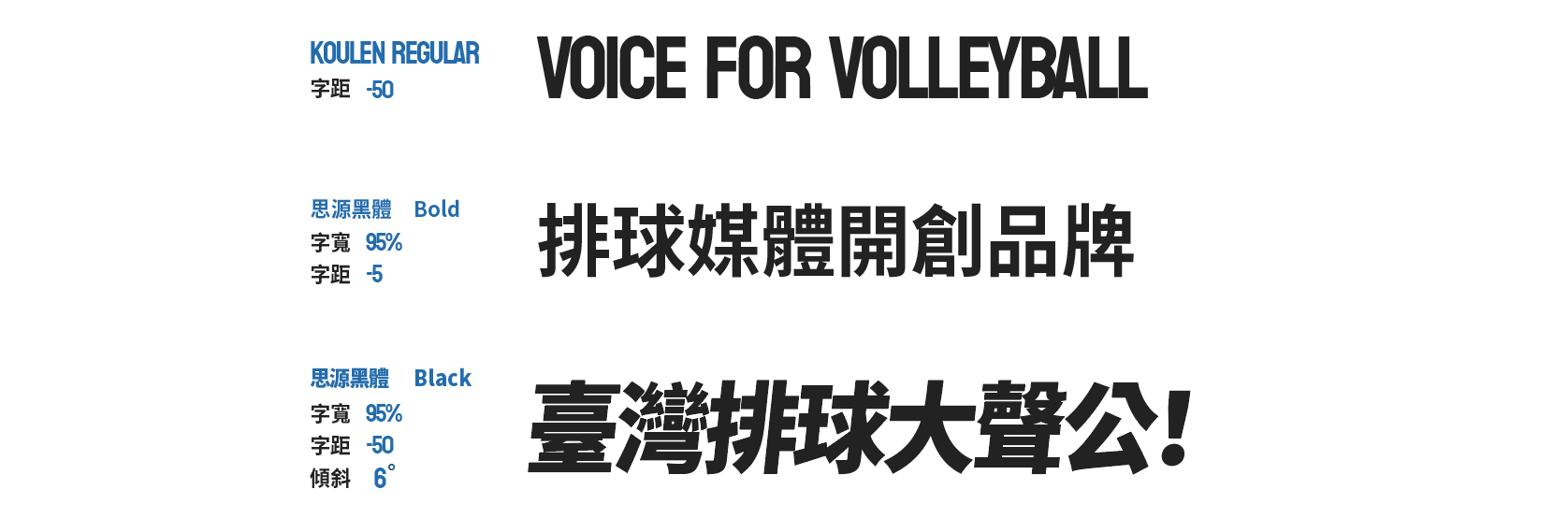
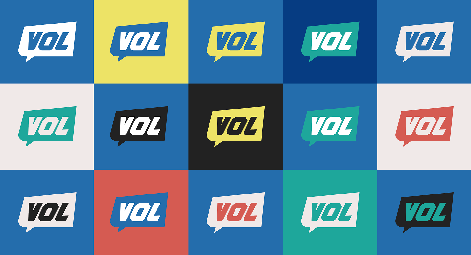
排球媒體品牌「VOL」在6週年時進行了品牌識別更新,延續了既有的「大聲公」圖像,搭配對話框的形式,強化「為排球發聲」的核心理念。大聲公象徵著品牌不斷傳遞排球訊息,對話框則代表著與排球社群之間的互動和討論。傾斜的粗體字設計帶來動態感,象徵排球運動的速度與活力,同時增加了視覺上的動感與活力感。整體色彩方案則維持品牌原有的藍白色調,突顯專業且清爽的形象,保持品牌的辨識度與一致性。這次更新不僅延續品牌的核心精神,還注入了更多現代與互動元素,進一步強化其排球專業媒體的定位。
The volleyball media brand "VOL" has updated its brand identity on its 6th anniversary, continuing the existing "loud and public" image and combining it with a dialog box to strengthen the core concept of "speaking for volleyball". The loud voice symbolizes the brand’s continuous delivery of volleyball messages, while the dialog box represents the interaction and discussion with the volleyball community. The oblique bold font design brings a sense of dynamics, symbolizing the speed and vitality of volleyball, and at the same time increasing the visual sense of movement and vitality. The overall color scheme maintains the brand's original blue and white tones, highlighting a professional and refreshing image and maintaining brand recognition and consistency. This update not only continues the core spirit of the brand, but also injects more modern and interactive elements to further strengthen its positioning as a professional volleyball media.