Google : Project Hatcher
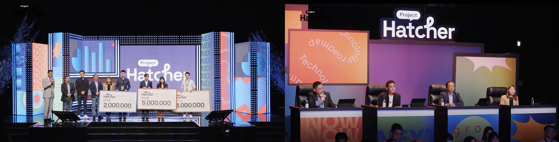
Google 台灣與國家發展委員會、台灣大哥大、鴻海科技集團共同主辦「Project Hatcher 孵創計畫」,一同響應政府打造台灣為亞洲矽谷的願景,協助新創拓展多元機會,也同時推出台灣第一個新創團隊競賽實境節目。
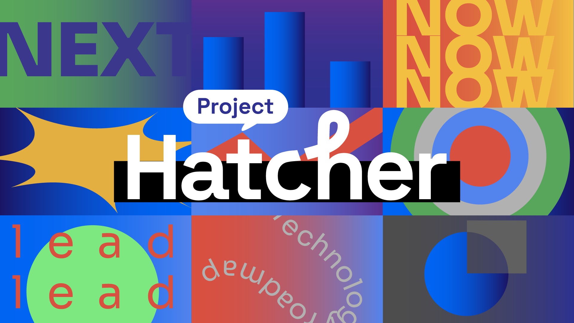
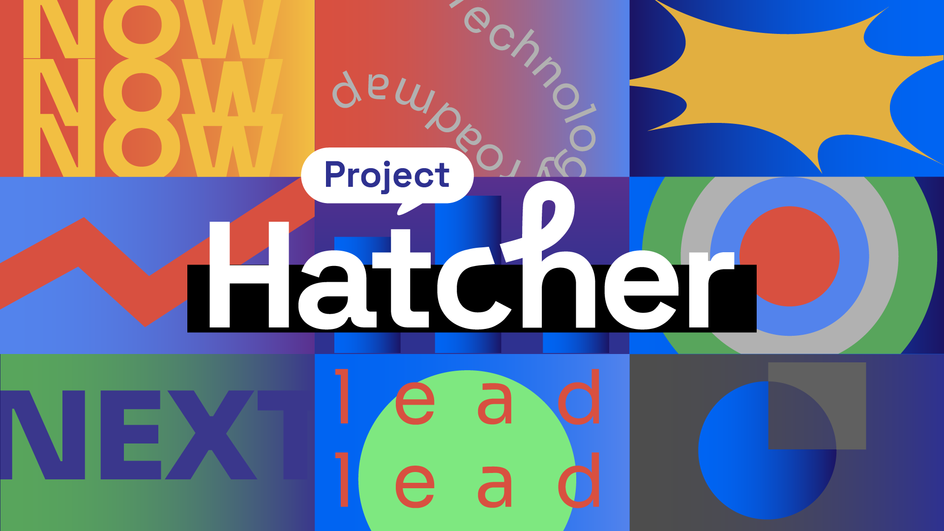
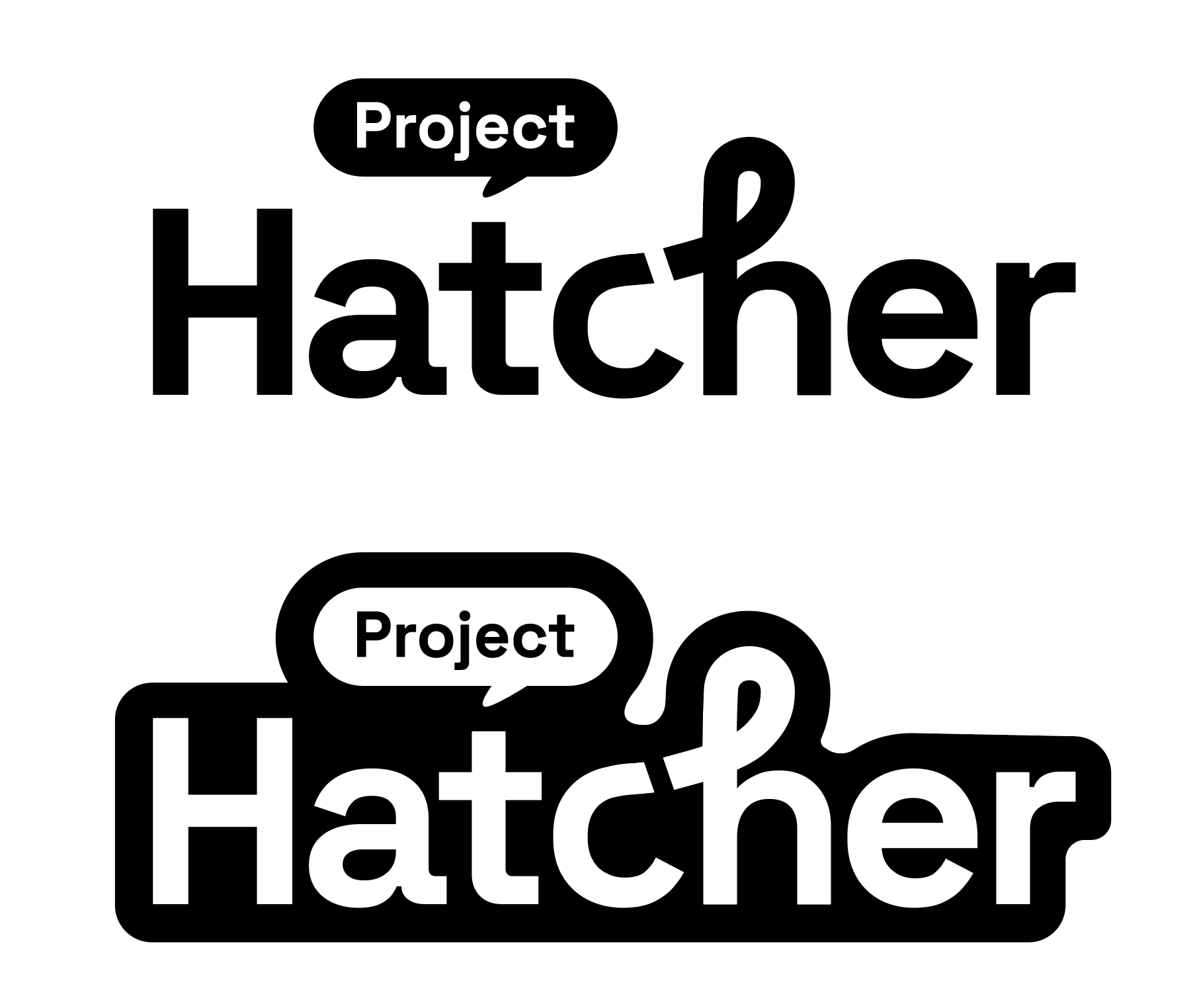
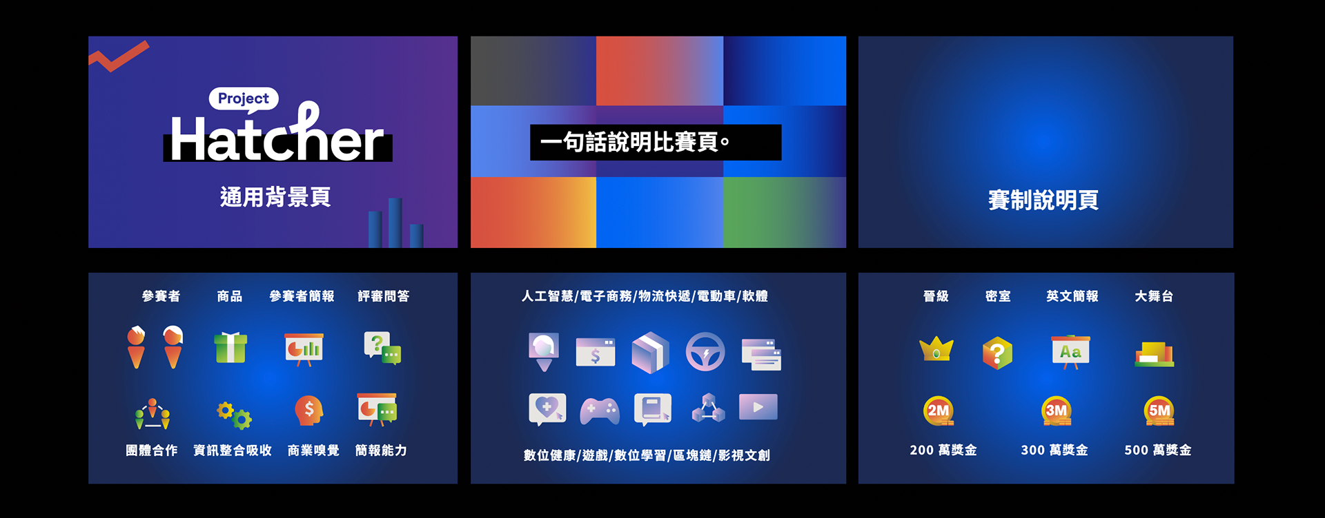
榮幸受邀負責主視覺、執行設計、影片icon素材、現場視覺設計。主視覺採用多種商業用途常見的幾何圖形,如箭頭、長條圖與圓餅圖,象徵新創企業面對的多元挑戰與機遇,並且展現出靈活且具結構性的發展,強調創業的多變性與創新精神。英文字體選用黑體圓潤的現代設計,表現出新創事業靈活且具適應性的特質。以簡潔大方的視覺語言,搭配現代化的色彩方案,營造出充滿活力與可能性的品牌形象,吸引具創意與動力的參與者。
Google Taiwan co-sponsored the "Project Hatcher" incubation program with the National Development Council, Taiwan Mobile, and Hon Hai Technology Group to respond to the government's vision of building Taiwan into Asia's Silicon Valley, assist new entrepreneurs in exploring diverse opportunities, and also launch Taiwan's first A reality program for a startup team to compete.
I was honored to be invited to be responsible for the main visual, executive design, video icon material, and on-site visual design. The main visual uses a variety of common geometric shapes for commercial purposes, such as arrows, bar charts and pie charts, symbolizing the diverse challenges and opportunities faced by new companies, and showing flexible and structural development, emphasizing the diversity of entrepreneurship. The font adopts bold and rounded modern design, showing the flexible and adaptable characteristics of new ventures. With a simple and elegant visual language, combined with a modern color scheme, we create a brand image full of vitality and possibility, attracting creative and motivated participants.
Client : Google - Project Hatcher
Production : 安大風 Andafn
Design : 柳捲
Release : 2023